Cubism & Early Abstraction · 1925
Counter-Composition of Dissonances XVI
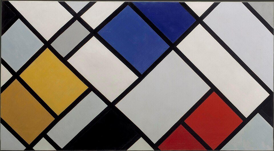
Counter-Composition of Dissonances XVI (1925) by Theo van Doesburg. Its palette is led by pale grey (#d1cdca, 32%) and light grey (#9ea19f, 19%), with accents of rich orange ochre, dark red, light gold and black. Overall the canvas is light, moderately saturated and warm.
Palette
- #d1cdca MG 212 pale grey 31.6% of canvas
- #9ea19f MG 213 light grey 19.2% of canvas
- #130f15 MG 223 soot 15.1% of canvas
- #2b3e81 MG 107 dark blue 11.4% of canvas
- #976a28 MG 178 rich orange ochre 6.2% of canvas
- #9c221d MG 020 dark red 6.1% of canvas
- #ba8f30 MG 038 light gold 5.4% of canvas
- #000000 MG 224 black 5.1% of canvas
Color families
Gray 41%, Black 19%, Blue 9%, White 9%, Brown 8%
Measurements
Details
More by Theo van Doesburg
- Card Players, 1916
- Composition IX, 1917