Realism · 1826
The Bridge at Narni
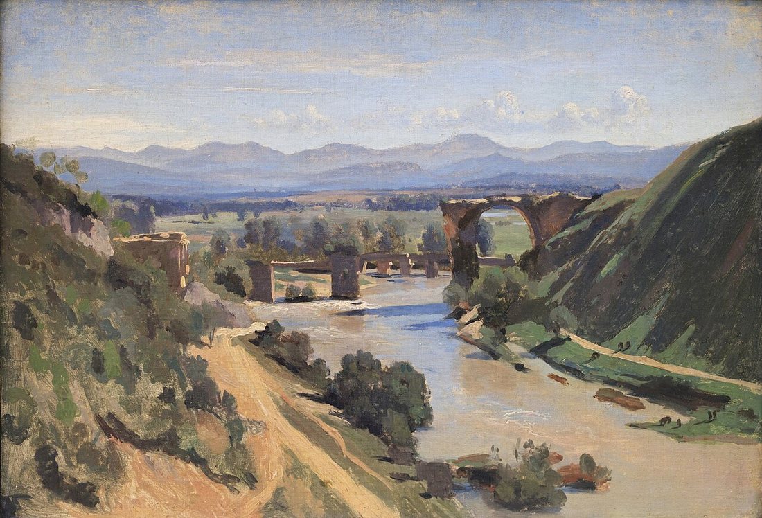
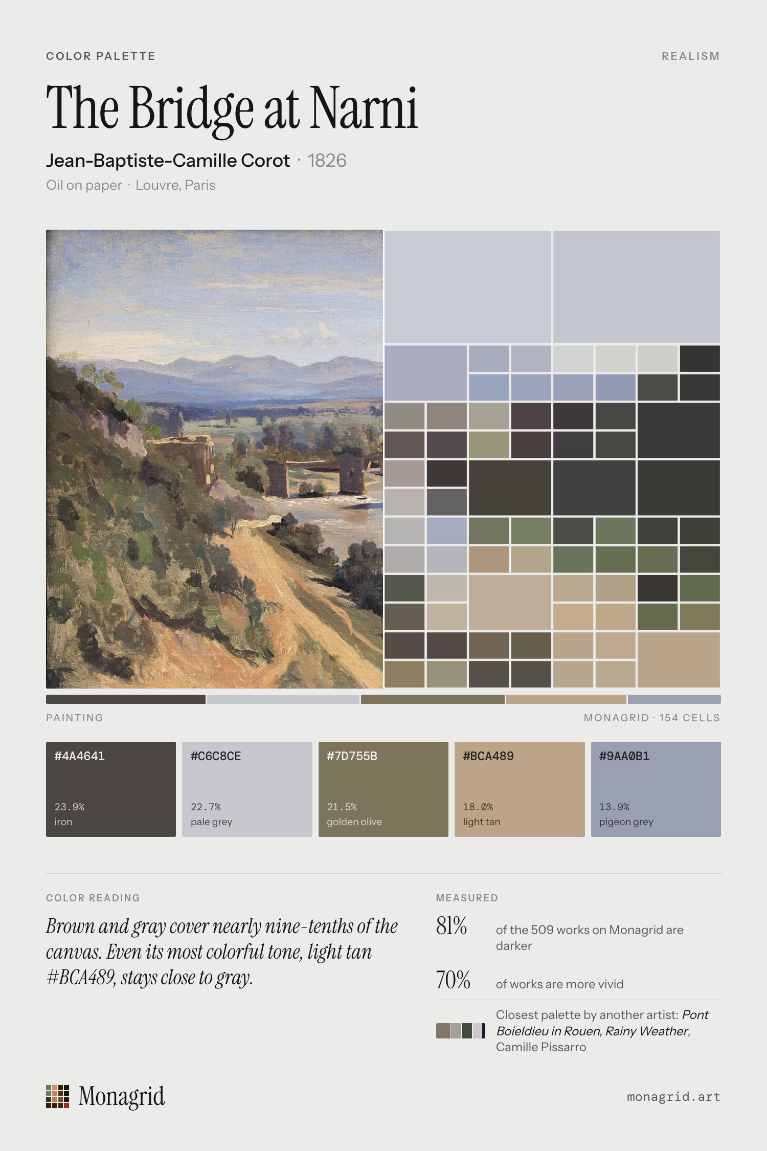
The Bridge at Narni (1826) by Jean-Baptiste-Camille Corot. Its palette is led by iron (#4a4641, 24%) and pale grey (#c6c8ce, 23%), with accents of pigeon grey. Overall the canvas is light, muted and warm.
Color reading
Brown and gray cover nearly nine-tenths of the canvas. Even its most colorful tone, light tan #BCA489, stays close to gray.
Palette
- #4a4641 MG 217 iron 23.9% of canvas
- #c6c8ce MG 212 pale grey 22.7% of canvas
- #7d755b MG 192 golden olive 21.5% of canvas
- #bca489 MG 164 light tan 18.0% of canvas
- #9aa0b1 MG 208 pigeon grey 13.9% of canvas
Color families
Brown 43%, Gray 43%, Blue 5%, White 3%, Yellow 2%
Measurements
Composition
52% of the visual weight is in the left half, 59% in the upper half. Symmetry 0.46 (how closely its shapes and edges mirror each other). 32% of the canvas is calm space. Half of the detail sits in 30% of the canvas. Measured from the image, not a rule the painter followed.
Details
Share
Download the pin · Save to Pinterest

More by Jean-Baptiste-Camille Corot
- The road from Sèvres to Paris, c. 1855
- Femme Lisant, 1869